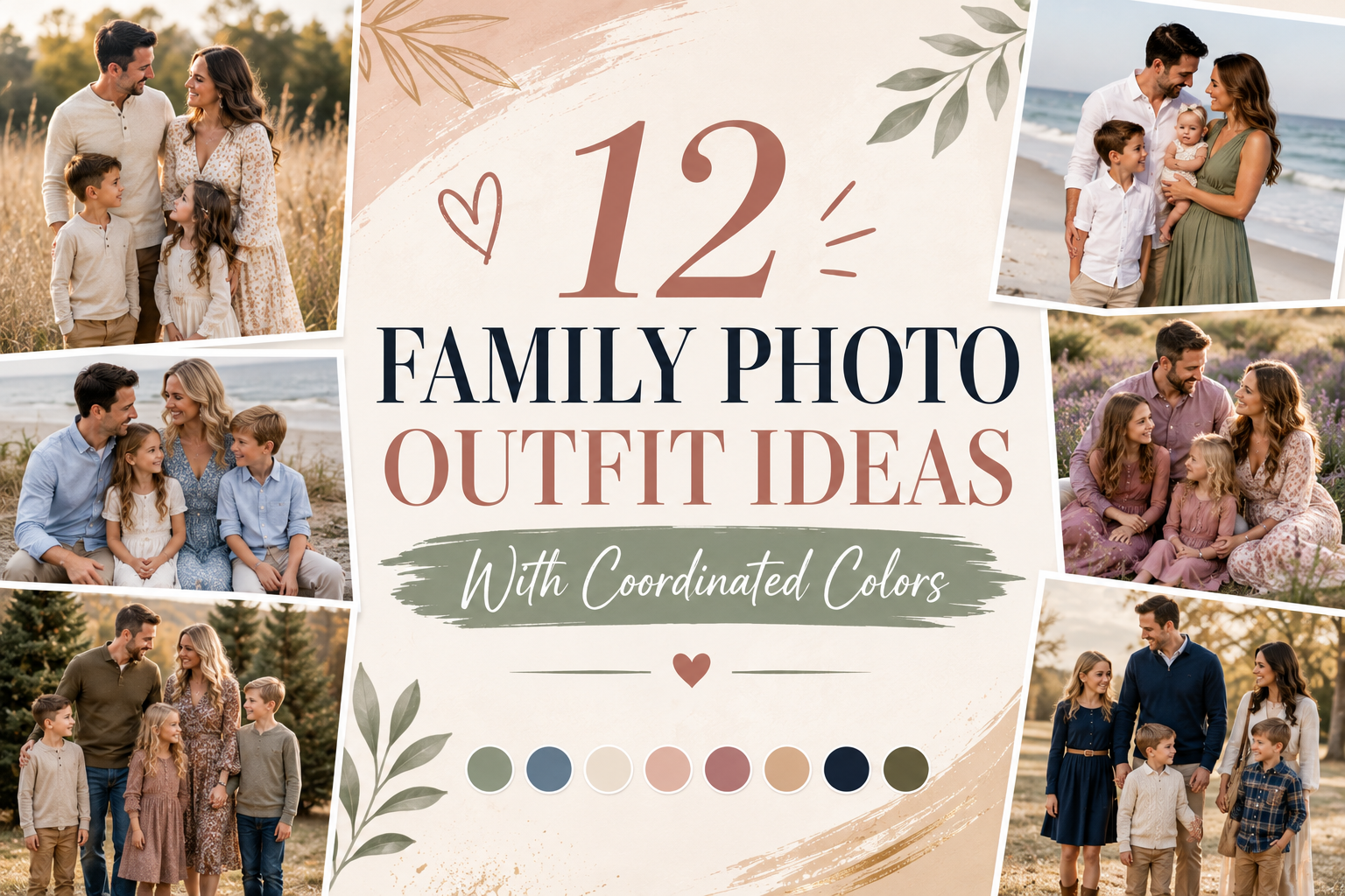
12 Family Photo Outfit Ideas With Coordinated Colors
Getting everyone dressed for family photos sounds simple until you open the closet and realize everyone has completely different ideas about what to wear. One person wants jeans, another wants something dressy, the kids refuse anything uncomfortable, and suddenly coordinating colors feels harder than taking the actual photos.
The good news is that your family does not need matching outfits to look connected. The best family photo outfit ideas with coordinated colors use a small group of related shades, comfortable fabrics, and different textures to create a natural look. Each person can still have their own style while the whole family feels visually connected.
Whether you are planning photos at home, in a park, on the beach, or during the holidays, the ideas below will help you build outfits that photograph beautifully. You will find soft neutrals, earthy colors, denim combinations, seasonal palettes, and simple ways to coordinate adults and children. I have also included practical styling tips, budget ideas, and image prompts for each look.
1. Cream, Beige, and Soft Brown for a Warm Neutral Look
Cream, beige, and soft brown create a relaxed family photo palette that feels warm without looking overly coordinated. Imagine everyone gathered on a porch or sitting together on a neutral sofa, with cotton, linen, denim, and knit textures adding subtle variation. The colors feel especially beautiful against greenery, wood, stone, or a light colored wall.
Start with cream or ivory as the base and let each person wear a different shade. One adult could wear beige trousers and an ivory blouse, while another wears a soft brown sweater with jeans. Children can wear cream tops, tan pants, or simple knit dresses. In my experience, the biggest mistake is putting everyone in the exact same shade. A little variation makes the photograph feel much more natural. You can build this palette for roughly $20 to $80 per person using pieces already in your closet.
2. Denim and White for Casual Family Photos
Few combinations feel as easy and timeless as denim with white. It works especially well for casual family photos because the colors are familiar and the pieces are usually already in your wardrobe. White shirts look crisp against blue denim, while different washes of jeans add enough variation to keep everyone from looking identical.
Try mixing straight leg jeans, denim skirts, white cotton shirts, simple blouses, and casual dresses. One child could wear denim overalls while another wears a white dress with a denim jacket. Keep shoes simple with sneakers, sandals, loafers, or neutral boots. A lot of people skip this step, but it makes all the difference: check that the denim washes do not all compete with one another. Two or three related washes usually photograph better. If you own most of the pieces already, this family photo outfit idea can cost almost nothing.
3. Sage Green and Cream for Outdoor Portraits
Sage green and cream work beautifully for family photos taken in nature. The muted green echoes grass, leaves, and trees without disappearing into the background. Cream keeps the palette light and gives the photographs a soft, airy quality.
Choose one or two people for sage pieces and use cream as the connecting color. A parent might wear a sage button down with beige trousers, while another wears an ivory dress with subtle green accessories. Children can wear cream tops with sage shorts, skirts, or trousers. Linen, cotton, and lightweight knit fabrics add visual interest without making the outfits feel busy. Avoid using too much bright green because it can compete with the surroundings. Sage clothing can often be found for $15 to $70, and neutral basics are easy to reuse.
4. Dusty Blue and White for a Soft Family Photo Palette
Dusty blue brings a gentle touch of color without becoming overwhelming. It is especially pretty for spring and summer photos, but it can also work indoors with soft neutral backgrounds. White, ivory, and light beige help balance the blue and keep the overall image bright.
Try placing the strongest blue shade on one adult and repeating smaller touches of blue throughout the rest of the family. For example, one parent can wear a dusty blue shirt, another can wear an ivory dress, and the children can wear white outfits with blue shoes, cardigans, or hair accessories. What I personally love about this palette is how easy it is to adapt to different ages. Keep patterns small and simple so they do not distract from faces. A complete outfit can cost around $30 to $100, depending on how many new pieces you need.
5. Terracotta, Cream, and Denim for Fall Photos
For autumn family portraits, terracotta adds warmth while cream and denim keep the palette grounded. Picture soft sweaters, textured scarves, denim jeans, ankle boots, and dried grasses against golden leaves. The colors feel seasonal without relying on obvious fall patterns.
Start with one statement color such as terracotta or rust. Add cream and denim around it, then introduce brown leather through boots or belts. An adult might wear a rust sweater with jeans, while another wears a cream knit dress and brown boots. Children can wear tan trousers, denim, or cream sweaters. In my experience, the biggest mistake is adding too many autumn colors at once. You do not need mustard, orange, red, brown, and rust together. Choose two warm shades and let neutrals do the rest. Expect to spend about $30 to $100 per person if you need several new pieces.
6. Soft Pink, Beige, and White for a Feminine Palette
Soft pink can add warmth and personality to family portraits without making every outfit look overly sweet. Blush, dusty rose, beige, and white create a gentle palette that works especially well for spring sessions, newborn photos, or portraits taken inside a bright home.
Choose different pink intensities rather than giving everyone the same shade. One person might wear a dusty rose blouse, another a beige sweater, while children wear cream or pale pink pieces. Add natural textures such as cotton, linen, knitted cardigans, or soft denim. Keep accessories understated so the colors remain the main feature. If you are photographing young children, prioritize comfortable fabrics and shoes they can actually move in. A simple coordinated look can cost $20 to $80 per person, and many families can create it from existing basics.
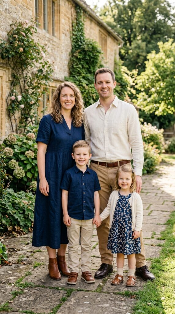
7. Navy, Cream, and Tan for a Polished Look
Navy gives family portraits a more polished feeling while cream and tan keep the palette approachable. This combination works well for professional family photos, milestone portraits, or pictures taken at a historic home or elegant outdoor location.
Use navy as an anchor rather than putting everyone in it. One parent could wear navy trousers or a dress, while another wears a cream shirt with tan trousers. Children can wear navy skirts, cream sweaters, tan chinos, or simple dresses. Brown leather shoes and belts can quietly connect the outfits. A common mistake is choosing very formal clothing for everyone. Unless the session calls for it, mixing dressy and casual pieces usually makes the photos feel more like your real family. You can create this look for around $40 to $120 per person, depending on what you already own.
8. Olive, Rust, and Cream for Cozy Autumn Portraits
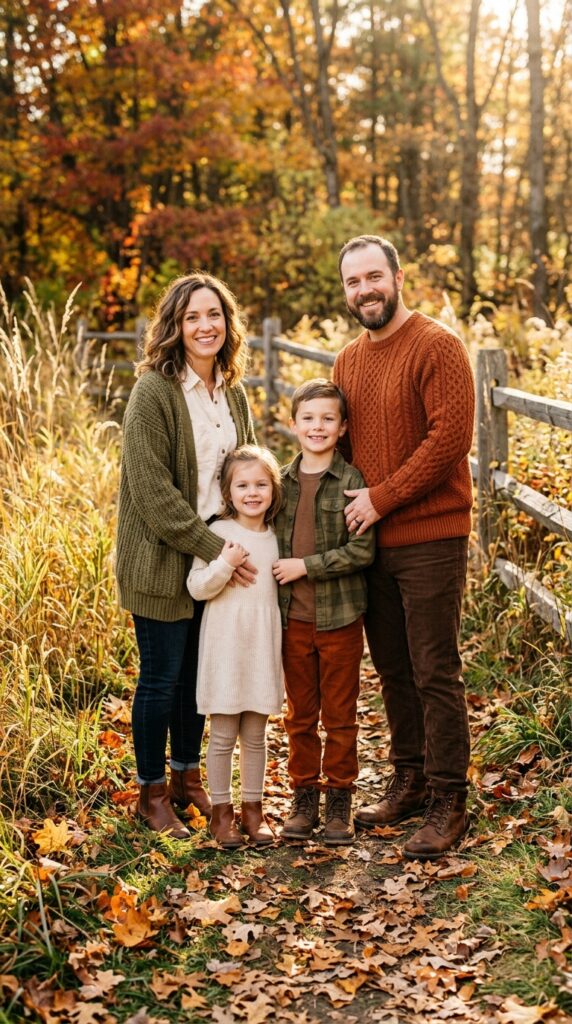
Olive green and rust create a richer fall palette than traditional orange and yellow. Add cream to soften the combination, then use brown leather accessories to bring everything together. This color story works beautifully against wood, brick, tall grass, and autumn foliage.
Choose one person to wear rust and another to wear olive, then let the children wear cream and tan. A knitted cardigan, corduroy trousers, textured skirt, or soft scarf can add depth to the photographs. Try not to give every person a patterned item. One subtle pattern is enough when you already have several colors in the palette. I always recommend this approach when someone wants a change without starting over: shop your closet first and identify existing olive, rust, cream, and brown pieces. New additions may only cost $15 to $60 each.
9. Black, White, and Camel for Modern Family Photos
If you prefer a more modern look, black, white, and camel create a clean family photo palette. The combination works especially well for urban portraits, indoor sessions, or photographs against simple architectural backgrounds. The contrast also makes clothing details easy to see.
You do not need everyone dressed formally. Try black trousers with a white blouse, a camel sweater with dark jeans, or a child’s white shirt with black trousers. Keep shoes and accessories neutral. Texture becomes important because the color palette is simple. Mix cotton, denim, knitwear, leather, and wool rather than relying on identical fabrics. In my experience, this approach photographs better than dressing everyone in black because the camel and white create breathing room. You can create the palette for about $30 to $100 per person using everyday wardrobe staples.
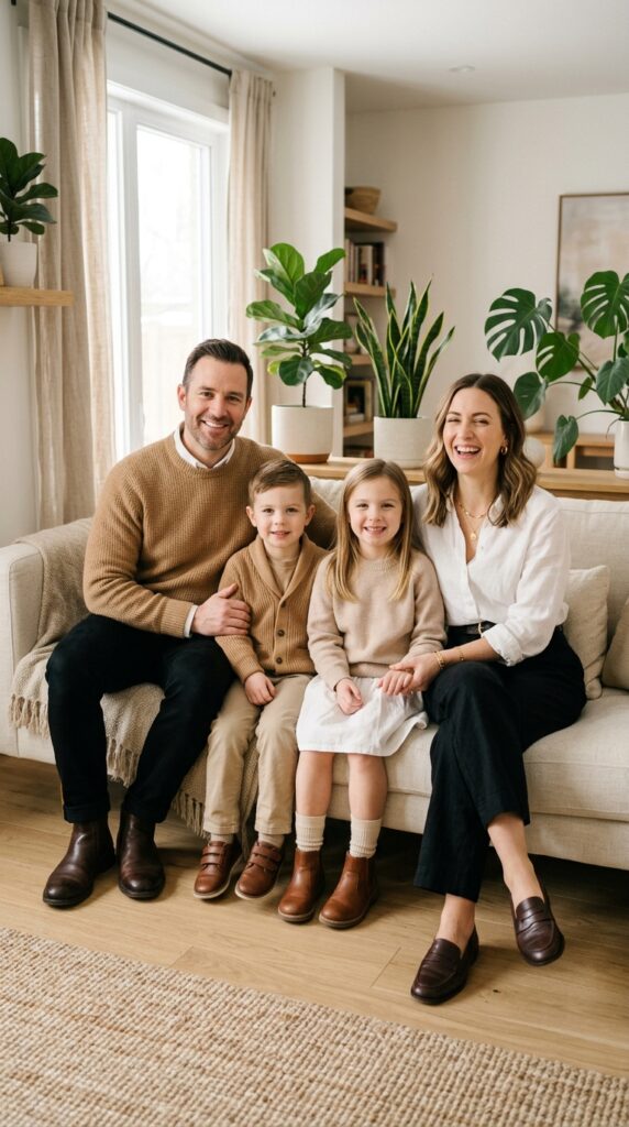
10. Coordinated Jewel Tones for Holiday Photos
Jewel tones can make holiday family portraits feel rich and festive without relying on matching Christmas sweaters. Deep green, burgundy, navy, plum, and cream create a sophisticated palette that works beautifully against warm indoor lighting.
Choose two main jewel tones and use cream or tan as the neutral. One adult could wear burgundy while another wears deep green, with children in cream and navy. Velvet, corduroy, wool, and knitwear can make the images feel especially cozy. Keep holiday patterns limited to one small detail if you want the photographs to remain timeless. A matching color story is usually more useful than matching outfits because everyone can wear pieces again later. Budget around $30 to $120 per person, depending on whether you are buying seasonal clothing or using existing pieces.
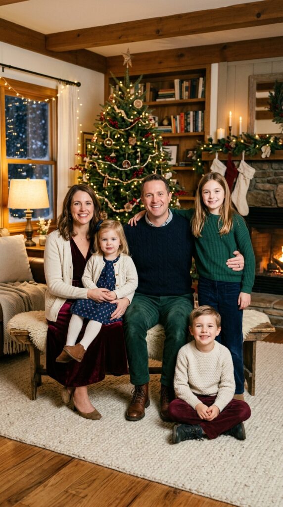
11. Coastal Blue, Sand, and White for Beach Photos
Beach family photos look especially beautiful when the clothing echoes the soft colors of sand and water. Light blue, white, cream, and sandy beige create an airy palette without requiring everyone to wear identical beach clothing.
Choose breathable fabrics such as linen, cotton, and lightweight gauze. One adult could wear a flowing cream dress while another wears a pale blue shirt and beige trousers. Children can wear white, light blue, or tan pieces. Bare feet or simple sandals usually work better than heavy shoes. Avoid very short or stiff clothing if you expect to sit in the sand or walk near the water. A lightweight linen shirt can cost $30 to $80, while children’s pieces may be less expensive. Focus on movement because wind and natural movement can make beach photographs feel much more personal.
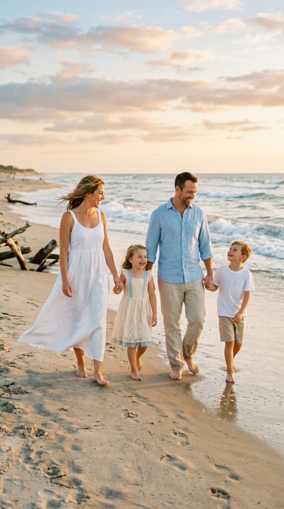
12. Earthy Neutrals for Timeless Family Portraits
If you want photographs that will still feel beautiful years from now, earthy neutrals are a reliable choice. Think oatmeal, taupe, cream, camel, warm gray, muted brown, and soft olive. These colors work in almost any location and allow your family’s expressions to remain the focus.
Give everyone a slightly different shade rather than creating a strict matching scheme. A parent could wear an oatmeal knit dress, another could choose tan trousers and a cream shirt, while children wear warm gray, beige, or olive. Mix textures to keep the palette from looking flat. Knitwear, denim, linen, suede, and cotton all photograph differently. A common mistake is choosing only very pale colors against a light background. If your location is already bright, add one or two medium tones for contrast. You can build this palette for $20 to $100 per person depending on your existing wardrobe.
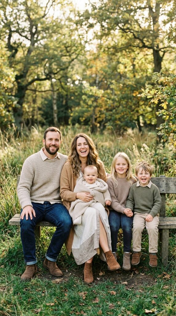
How to Coordinate Family Photo Outfits Without Matching
The easiest way to coordinate family outfits is to think in terms of a color palette rather than identical clothing. Pick three to four colors that work together, then give each family member a slightly different combination.
For example, your palette could be cream, sage, beige, and denim. One adult might wear cream and beige, another could wear sage and denim, and the children could wear cream with small touches of sage. The colors connect everyone without making the photo look like a uniform.
Texture is just as important as color. If everyone wears smooth cotton, the image can look flat. Add denim, knitwear, linen, corduroy, or a textured cardigan for variety.
Patterns should also be used sparingly. One floral dress or subtle striped shirt can add personality, while several large patterns competing together can make the photo feel busy.
What Colors Photograph Best for Family Pictures?
Soft, muted colors generally photograph well because they do not compete with faces. Cream, beige, dusty blue, sage, soft pink, olive, denim, camel, and warm brown are easy choices.
That does not mean you need to avoid darker shades. Navy, burgundy, forest green, chocolate, and black can create beautiful contrast, especially for evening or winter photos.
Consider your background before choosing the palette. A family wearing pale cream against a white wall may lose some visual definition. Likewise, bright green clothing can disappear into a leafy outdoor setting.
Natural light also changes how colors appear. If possible, try the outfits near a window or outside before the photo session. This gives you a much better idea of how the colors actually look together.
Conclusion
Family photos do not need matching shirts or identical dresses to look beautiful. In fact, coordinated colors often create a more natural result because everyone can keep a little of their own personality. The key is to choose a small color palette, repeat those shades in different ways, and mix fabrics and silhouettes.
These 12 family photo outfit ideas with coordinated colors give you plenty of starting points for different seasons and locations. You can use cream and beige for warm neutral portraits, denim and white for casual photos, sage and cream for outdoor sessions, or richer shades such as rust, olive, and burgundy for autumn and holiday pictures.
You also do not need to buy a completely new wardrobe. Start by pulling pieces from your closets and laying them together on the bed. Remove anything that feels uncomfortable, overly bright, or too similar to another outfit. Then add one or two pieces if something is missing.
The goal is not to make everyone look the same. It is to create a collection of outfits that feels connected while still looking like your family.
Which color palette would you choose for your next family photo session? I’d love to hear what you’re planning.
Frequently Asked Questions
How many colors should a family wear for photos?
Three to four related colors are usually enough for a coordinated family photo palette. You can use one or two main colors along with neutrals such as cream, beige, denim, or gray. This gives everyone flexibility without making the final image look disconnected.
Should everyone wear the same color for family pictures?
No. Matching colors can sometimes make a photograph look too uniform. Instead, choose a shared palette and let each person wear different combinations from it. Small repetitions, such as a child’s sage cardigan matching a parent’s shirt, can visually connect the group.
What colors should families avoid in photos?
Extremely bright neon shades can draw attention away from faces, especially in natural outdoor settings. Very small, high contrast patterns can also look distracting in photographs. Before the session, consider the background and avoid clothing that blends into it too closely.
Should family members match their outfits to the location?
Your clothing does not need to match the location exactly, but it should work with the surroundings. Soft neutrals and earthy colors are useful outdoors, while stronger contrast can work well against light walls. Consider the colors already present in your photo location when creating your palette.
What should kids wear for family photos?
Choose comfortable clothing that allows children to move, sit, and play. Cotton, soft denim, knitwear, and breathable fabrics are good choices. Avoid anything that needs constant adjustment because uncomfortable clothing can make children less relaxed during the session.